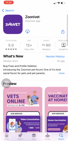
38 % of pet Indian pet parents are dissatisfied with their current veterinary consultations and are actively seeking alternative options to ensure better care for their pets, reasons are:
Scheduling appointments as per availability / convenience
Risk of pets contracting infections
Queueing in clinic
24/7 availability of veterinary services
Commute
Access to a wider pool of doctors
Target customer
Pets (Dog, Cat, Rabbit, Bird)
Pet Parents
Team
3 Product designer
1 Product managers
4 Engineers
1 Product Owners
Target area
Bengaluru, Karnataka (India)
Project duration
2 years
Problem Statements
Solved lot of UX problems in this project, but I would love to introduce two problem statements.
Less footfall in Video Consultation and Home Vaccination
Indication for Creating Post was not clear
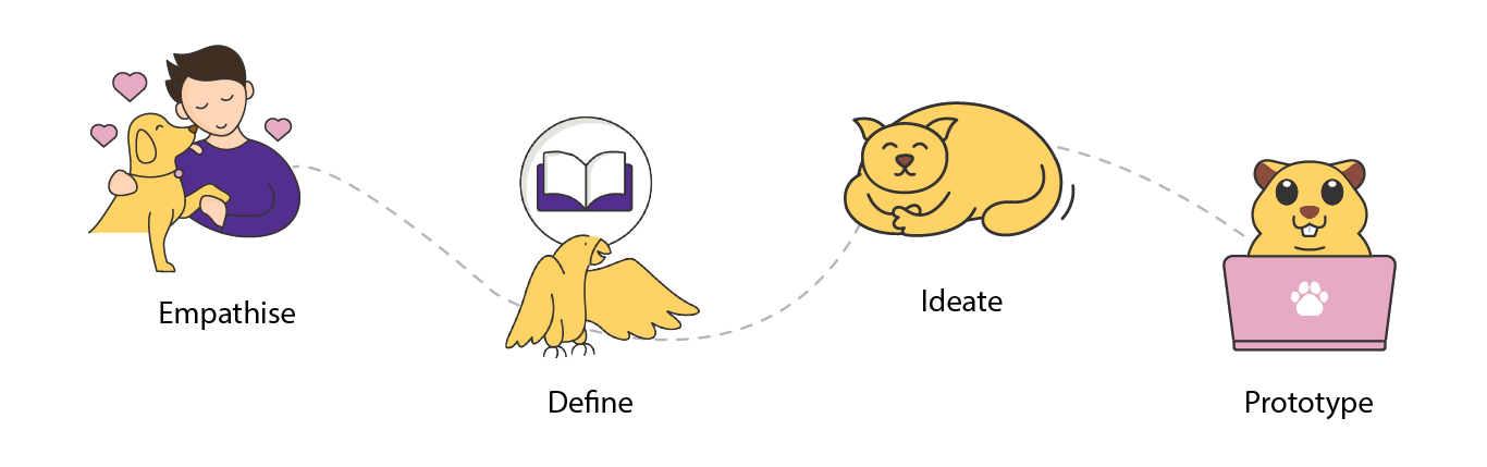
Design Process
Empathise
User research
Here we have understood the pain points, behaviors, needs, motivations, and preferences of users.
I conducted thorough competitive research, analysed major competitors’ products to understand their functionality and processing methods. This informed our app’s feature prioritisation based on user needs.
Key takeaways
Prioritize user and business needs.
50% of Indian pet parents in Tier 1 cities and 33% in Tier 2 and 3 express desire for online veterinary consultations.
Pet parents seek a one-stop solution for pets, including consultation, vaccination, home diagnostics, surgeries, and pet products.
Improve UI.
Define
How might we...
HMW improve the home screen design with proper Information architecture which align with both user and business requirements.
HMW improve the video consultation flow.
HMW clearly indicate create post.
Ideate and Prototype
Nielsen's usability heuristics
Adhering to some of Nielsen’s Usability Heuristics principles i.e: Visibility of system status, Match Between the System and the Real World, User Control and Freedom, Consistency and standards, Help and documentation, Recognition Rather than Recall, flexibility and efficiency of use, the new designs underwent multiple iterations. Each iteration was a step towards achieving a balance between displaying sufficient information and maintaining a clean, uncluttered design with minimum interaction . This iterative approach aligns with the UX principle of continuous improvement, ensuring the final design meets user expectations.
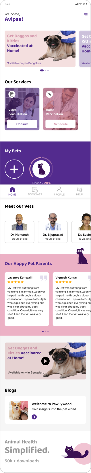
Old home screen design
Heuristic evaluation
Number of users clicking on video consultation and home vaccination was the least for quite some time
No need of back button on home page
Bottom navigation unclear
Lot of UI and accessibility issues in terms of fonts and visibility
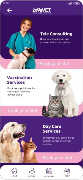
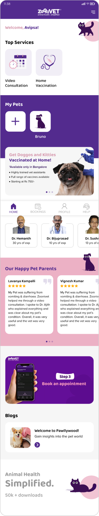
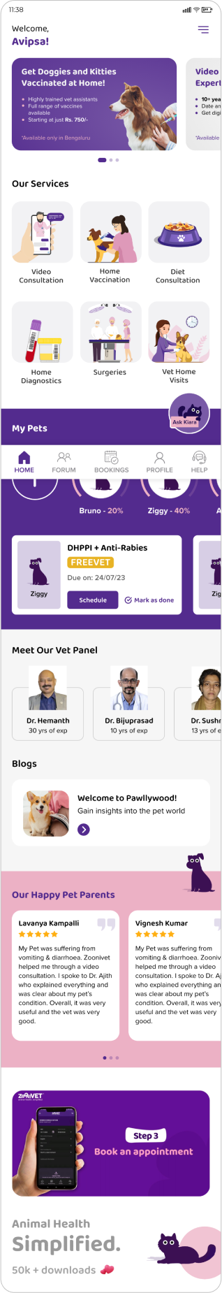
New home screen designs
Concept 1
Users were able to find top services but realizes, the icons were prominently not defining the services
My pets profile clearly not indicating how much % its completed.
Offer banner was less noticeable, as it was below my pets section.
Concept 2
Offer banner was now noticeable, but find little accessibility issue like readability and alignment.
If add more services, then every card will be in two colors only.
Final Design
Information architecture is meticulously crafted to align with both user and business requirements.
Banner designs adhere closely to Nielsen's Usability Heuristic of Consistency and standards, undergoing numerous iterations. Each iteration represents a progression toward striking a balance between providing ample information and preserving a sleek, clutter-free design.
The addition of new services incorporates playful graphics while adhering to established design guidelines. Used icons familiar to the users like: home, bookings, profile etc.
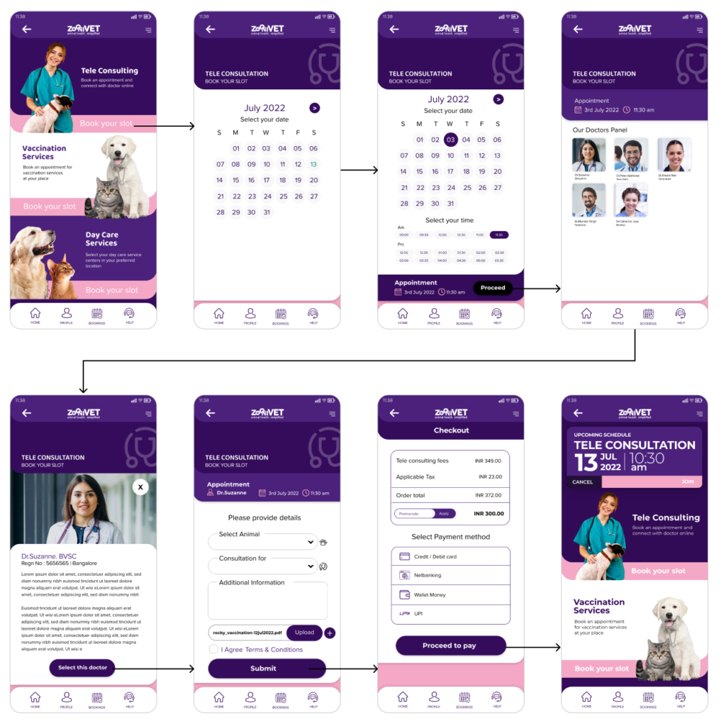
Old video consultation flow
Heuristic evaluation
Proceed button not visible
Improper UX writing: “Select Animal”
Too many steps for users to click
Doctors unavailability
Too much dominance of primary color
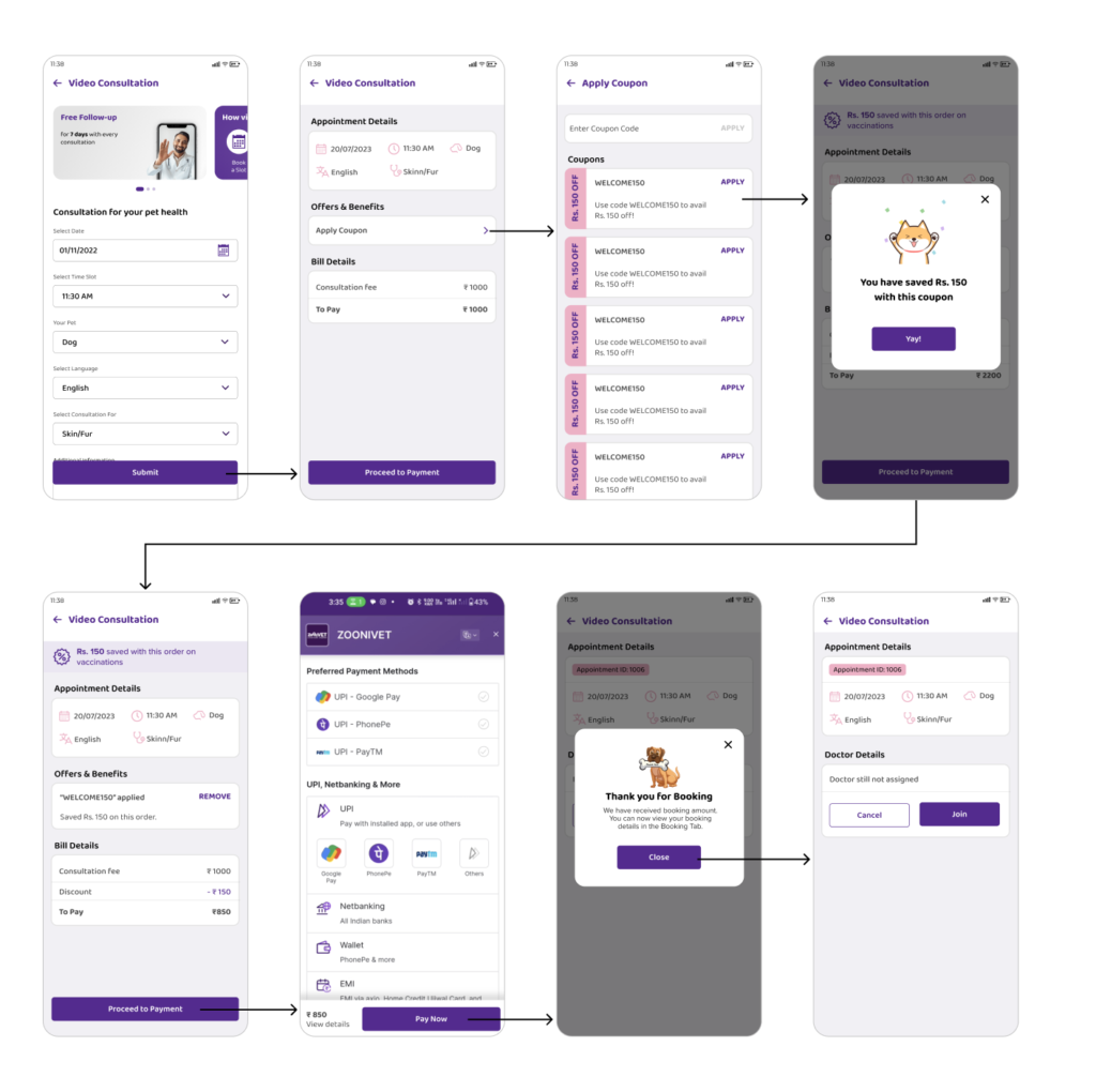
New video consultation flow
Consultation Form
Appointment, Offer, Bill Details
Coupons
Coupon Success Popup
Bill Details after Coupon Applied
Payment
Booking Success Popup
Booking Details
Usability findings
Users expressed satisfaction with completing all the required information on a single screen.
There were no concerns about doctor availability from the business perspective.
System status indicators, such as applied coupons and booking success messages, were clearly visible.
Cancel and close buttons/icons on pop-ups were provided to adhere to user control and freedom principles.
A clean and intuitive layout was achieved by upholding consistency and standards throughout the interface.
User memory load was reduced by ensuring visibility of elements, actions, and options, such as indicating the coupons used.
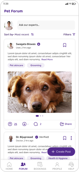
Create post
Users were feeling difficulty or they were confused how to create a post in forum screen, because there were no specific button or indication for create post.
The goal was to improve the user experience of creating a post in the forum screen by adding a specific button or indication for creating a post, ensuring users quickly find, where to post.
Adhering to Nielsen’s heuristic of flexibility and efficiency of use, the create post button underwent multiple iterations. Each iteration was a step towards achieving a balance between displaying sufficient information and maintaining a clean, uncluttered design. This iterative approach aligns with the UX principle of continuous improvement, ensuring the final design meets user expectations.
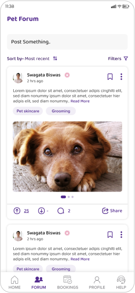
Old design
Post something bar unclear
Wrong UX writing
Not conveying what to do
No help offer or information about how to create post
Users were confused what to do in Forum page or how to post
10% of users were able to post
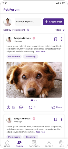
Concept 1
40% Users find big button is user friendly, its clearly calling out
UX problem: 2 CTAs at the same position for same action
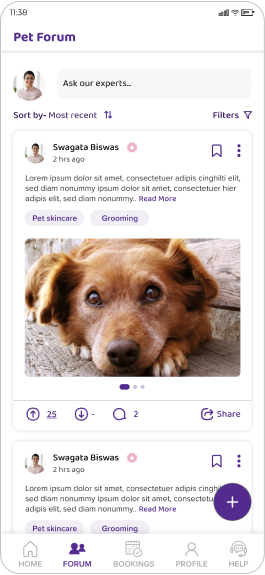
Concept 2
60% Users find plus button is user friendly, as they were familiar to it, applied Nielsen's Usability Heuristics principles Match Between the System and the Real World